Case Study: Houston Met Dance Branding
CHALLENGE
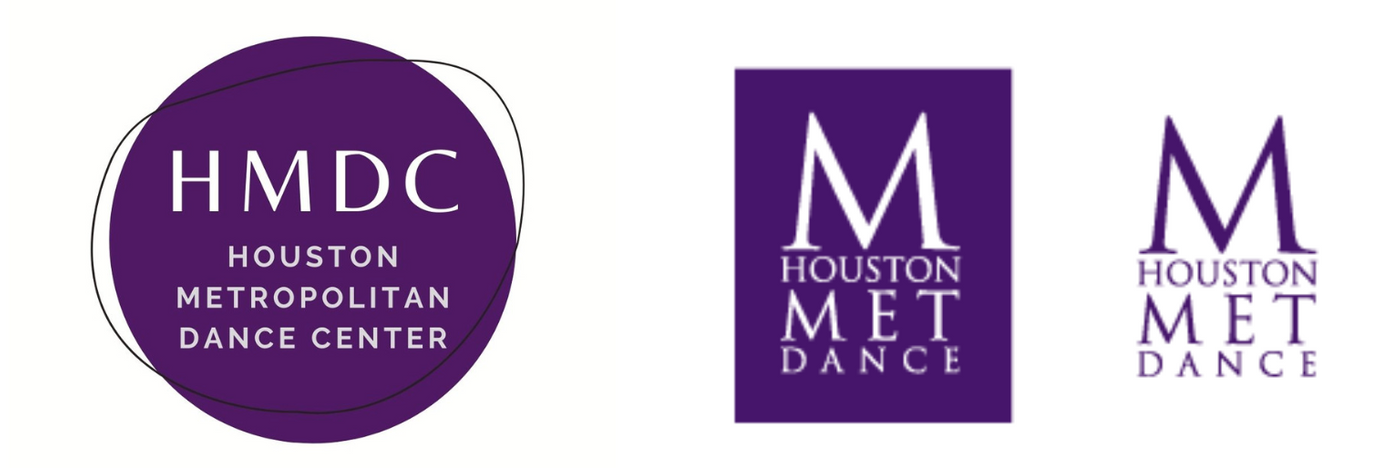
Houston Metropolitan Dance Company came to the Like Minds team at a crossroads. With much of its mission changing, along with the audiences it connects to and serves, it was unsure if its current name and logo were the best fit. The organization never created a true brand identity and utilized various logos (see below for a few versions) throughout its 25 year history. Like Minds was determined to build a brand that not only resonated with past audiences, but with current and future constituents, as well, all while keeping rates affordable for the organization which was struggling financially.
STRATEGY
The Like Minds team conducted both a SWOT analysis and a competitive analysis. The team found that while Houston Metropolitan Dance Company may not have done so intentionally, it built a following who lovingly referred to it as "The Met" or "Houston Met." As such, our team decided that shortening Metropolitan but keeping the "Met" would be essential for the brand, honoring its past while welcoming in a bright future.
RESULTS
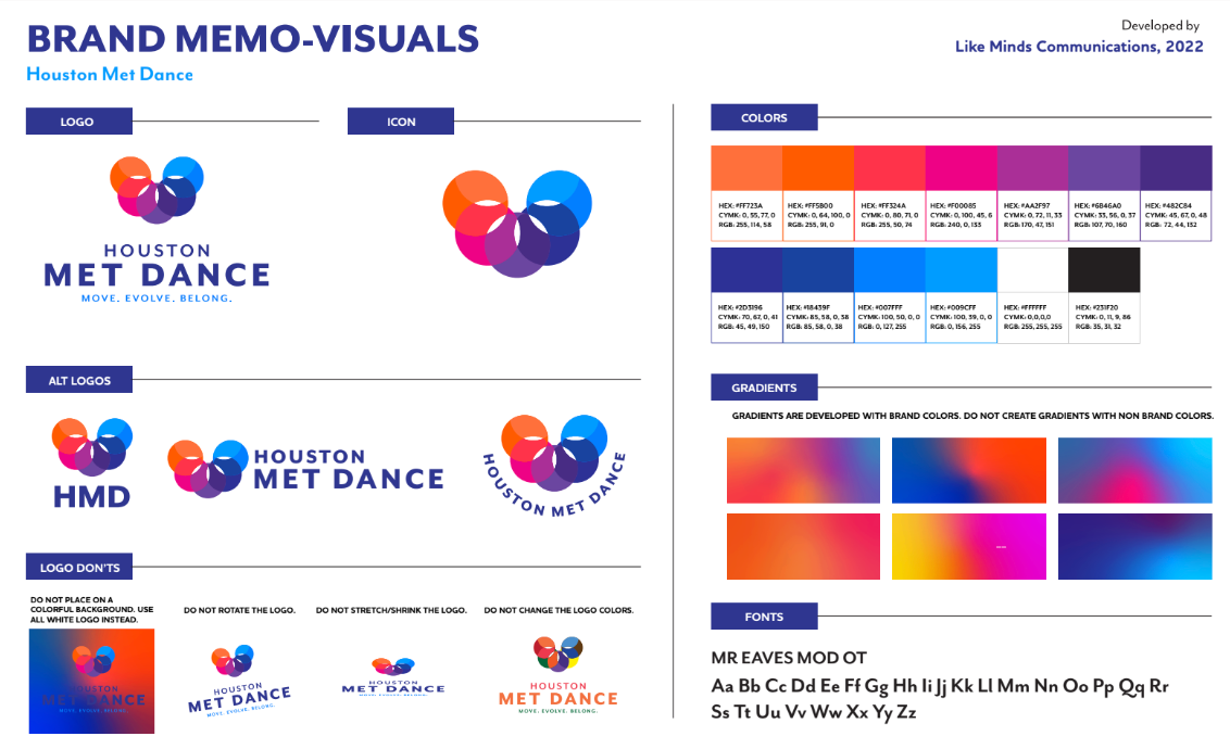
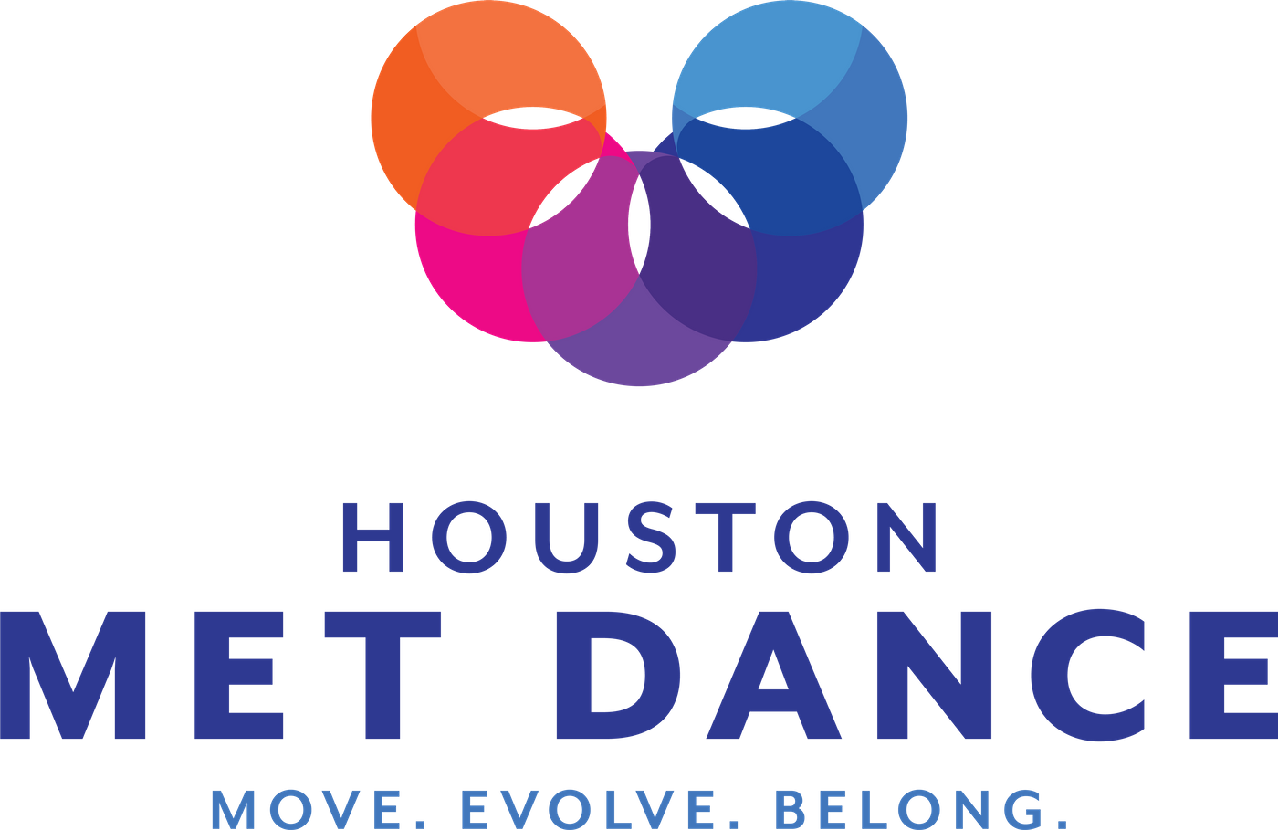
The Like Minds team presented its SWOT and competitive analyses findings to the client and recommended moving forward with the more straightforward Houston Met Dance brand name. From here, our team developed two logo options. Once the team reviewed both logos, we selected a final logo and developed brand guidelines and an email marketing template utilizing the new branded look and feel.
The final logo was inspired by a feeling of movement, the pelvic bones which are so crucial to dancers' success and the passion and love Houston Met Dance's community feels for their art and the organization. Our team also developed and delivered a new tagline and key messages to enable the organization to better communicate its value across all digital and traditional media.